Alternate Mii-ality 01 – Introduction

I may have mentioned a week or two ago that I had an idea for a sorta-kinda webcomic. I say “sorta-kinda” because it’s not a webcomic in the traditional sense. You see, I joined Nintendo’s Miitomo when it first came out and I immediately became addicted to it. Specifically, I became addicted to what Miitomo calls “Miifotos.” If you haven’t played Miitomo, here’s an explanation.  

Miitomo is a social media app that allows you to create a digital mini-version of yourself called a Mii. Miitomo asks your Mii questions – what’s your favorite bread; what are your hobbies; would you rather be invisible or have the power of flight. You answer the questions, and then you can see how other people answered them and comment on what they said. You can also visit other people’s Miis for a question and answer session. Your Mii earns virtual coins for answering questinos and for commenting on other folks answers. There are also mini-games to play, and a shop where you can spend your virtual coins on virtual outfits for your virtual Mii. And once you change into a new outfit, Miitomo asks if you want to take a Miifoto!

I don’t know why I’m addicted to the Miifotos, but I am. When you enter the Miifoto portion of the app, you can set the background, the pose and expression of your Mii, and add little extras like stickers and word balloons to turn your Miifoto into a CARTOON. Okay, so maybe that’s why I’m addicted to Miifotos.

I play Miitomo daily, so I very quickly accrued a bunch of Miifotos. I share each day’s Miifoto on Twitter, but I thought I could start running them here as well. You might get a kick out of them. Or you might decided I’ve finally gone round the bend. Either way, here’s the very first Miifoto I made!

Miifoto

My very first Miifoto!


Yeah, it’s not the most amazing thing in the world. The background, outfit, wings and sparkles all came from Miitomo, as did the Mii itself, plus its pose and that weird cat face 🙂 But the moment I made this, I immediately knew, I wanted to make another one, and I wanted to make it BETTER. So over the next few months, you’ll see a slow evolution from half-assed snapshots to some images that I think are very cool!

Playing around with Bryce 7

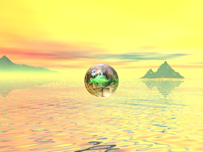
I’ve been indulging myself in old hobbies the last couple weeks. This week I dusted off some of my 3D software and started playing with it. Here’s a render I did today using Bryce 7. Bryce 7 is an environment creation program. I’ve become more and more interested in landscapes lately, so playing with this program really suits my mood.

Bryce 3D

Bryce 7 render

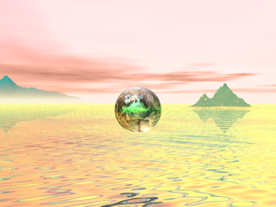
Of course, I can never leave anything alone, so after I rendered this in Bryce, I took it over to Photoshop to play with a bit. Mainly just to prove to myself that I still know how to use both Bryce and Photoshop together…

Bryce 3D

Bryce 7 render with some post-work done in Photoshop

I’m rendering an animated version of this now, so when that’s done, I’ll post it as well. Enjoy the artwork!

WIP Wednesday – Noir book cover at sea!

This is far from finished yet, but here’s what I’ve been working on this week, a book cover for a paranormal mystery. I need to refine the guy lurking in the background, plus I’d like to add some details to the woman’s dress, then change the lighting a bit to make this a nice sunset scene. Of course the biggest problem is the background image of the ocean. That horizon line doesn’t line up with the set or the characters at all! Once I’ve got a decent 3D rendering, I’ll be looking at converting the whole thing into a painted image via the wonders of Photoshop!

And that’s this week’s WIP 😉

Personal Art – Aphrodite in Stone, 2005

Aphrodite in Stone, 2005

This is another rare ZBrush image for me. I had no idea what I was doing when I started it, and I’m not sure what I learned from it other than the fact I find ZBrush to be very confusing. I so wanted to learn how to make poseable 3D figures, but doing this piece hurt my tiny little brain. I did like the end result, however. I especially liked the hair and the sea shell she’s holding. That blue to yellow blend worked wonderfully. I think that was a texture map I painted in Corel Photopaint, so this one wasn’t entirely done in ZBrush, but 99.9% of it was.

Cover Art – Eternally Noir

Eternally Noir, 2004

I’ve decided to redo the art gallery for this website in a fashion that will make life easier for me. Rather than try to set up a page with little thumbnails that link to other pages I have to create by hand, I’m simply going to post each piece of finished art I’ve got as a blog entry, under the delightful category of “Gallery.” I’ll change the link at the top menu to go straight to this category, so you can see every blog entry just by scrolling through.

And since I’m redoing things, I thought I’d start way, way back at the very beginning of my career as a paid freelance artist. The image above was created in 2004 and is one of the very first ebook covers I did for Logical-Lust Publications. The title was Eternally Noir and the brief I got just said to design something spooky and sexy. This image was inspired by a Michael Whelan book cover done for the Tanith Lee short story collection Red as Blood, a series of fairy tales done by the Sister Grimmer herself.

The image started in ZBrush, where I created the tree in the background. I created the bloody red sky in Bryce, and put all that behind a model in Poser. Then after the final render, I took everything into Corel Photopaint to work a little post-FX magic, enhancing the highlights and shadows and adding that lovely poisonous red glow to the apple. You know, if I recall correctly, I may have actually created that apple in Carrara and mapped it in UVMapper. Can’t recall that far back to be certain.

Anyway, this turned out to be the first of many covers I have done for Logical-Lust, and the first of many that I ended up using everything including the kitchen sink to produce.

ZBrush Tree

Here I am, back with the program I love to hate. Between sick kids, a broken car, and other schedule screw ups, I haven’t been able to put paper to pencil lately, so I’m reverting to some digital work to fulfill my daily art requirements (even then, I’ve still missed a couple of days recently; that’s got to stop!). The above may not look like much, but it’s a work in progress. ZBrush has a nifty little tool that allows you to easily build branching objects, including trees, people, anything with legs and arms that go off in different directions. This is my first pass at a tree. It’s got a long way to go before it reaches it’s final form.

The Happy Flower

I decided to play around with ZBrush today, a program I love to hate. This is about the level of success I can get with this program. I just can’t wrap my brain around how it works, and frequently when I try to do things, the program crashes and I lose all my work. But sometimes I can do simple little things like this.