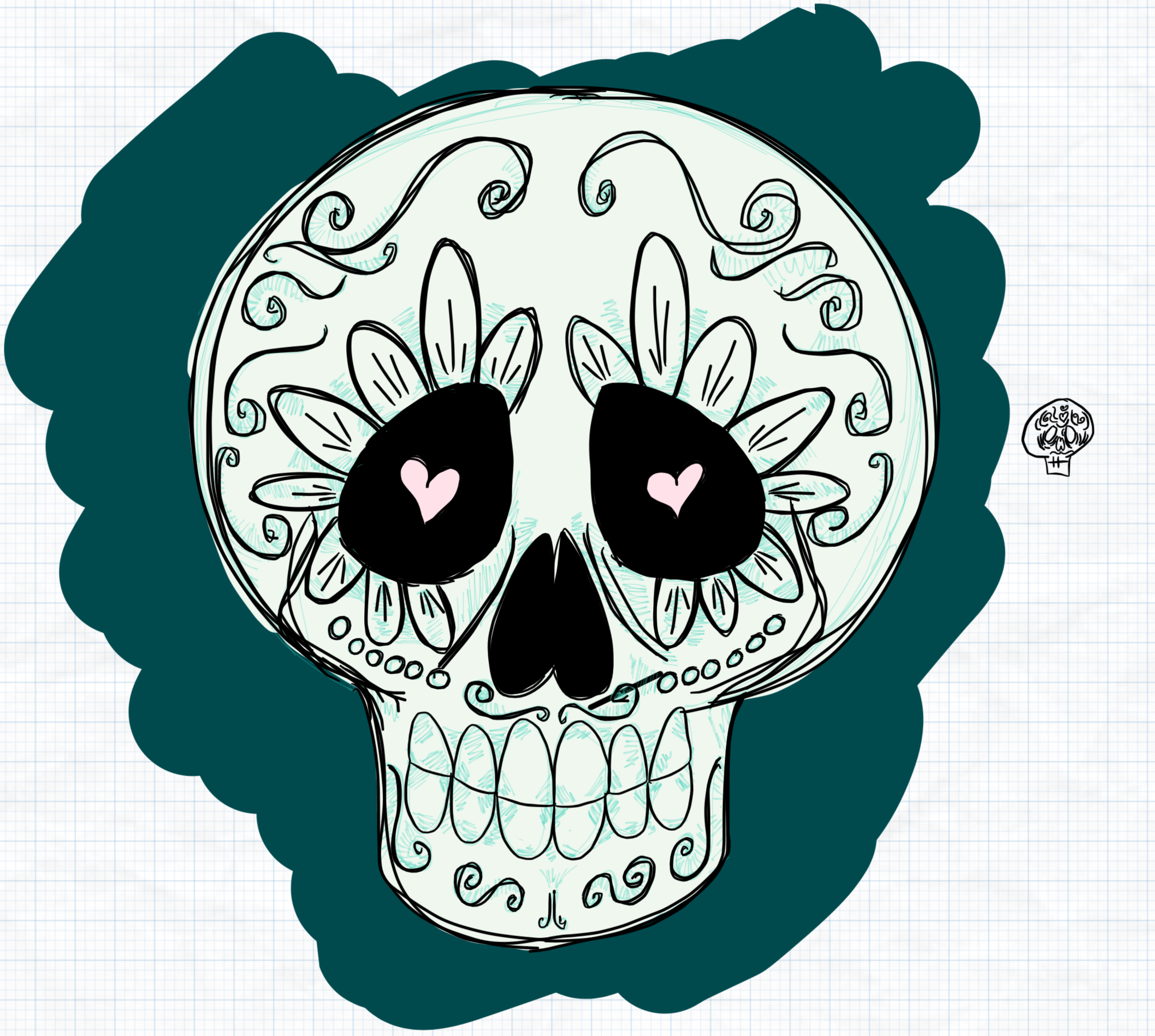
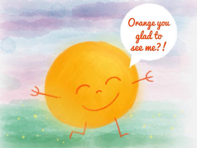
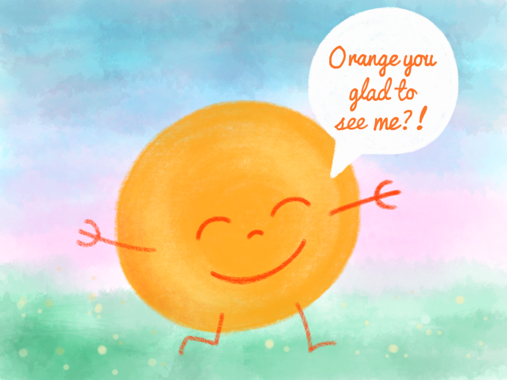
I do a lot of artwork on my iPad, so I’m always on the lookout for new drawing and painting apps. I downloaded one last week that I thought looked promising – Tayasui Sketches. It had a lot of the same tools I see in other drawing apps, but there was something about the texture of the sample artwork that made me want to try it out. The basic app is free and allows you to sample the full version for an hour. The full version costs $4.99. Now $4.99 isn’t a lot, but I do prefer to try before I buy, so I did the one-hour trial and drew this quick image to test out all the tools:

Test drawing done in Tayasui Sketches
I really liked the paper grain texture on this. Tayasui Sketches is one of the few apps I’ve seen that includes the option of adjusting the background for paper grain as well as color. However, I did NOT like the way the text tool worked and I didn’t care at all for the way the app handles zooming and panning in the image. The tools had a nice texture (I especially loved the rough edge on the orange), but I knew some of the apps I already owned could produce similar results.
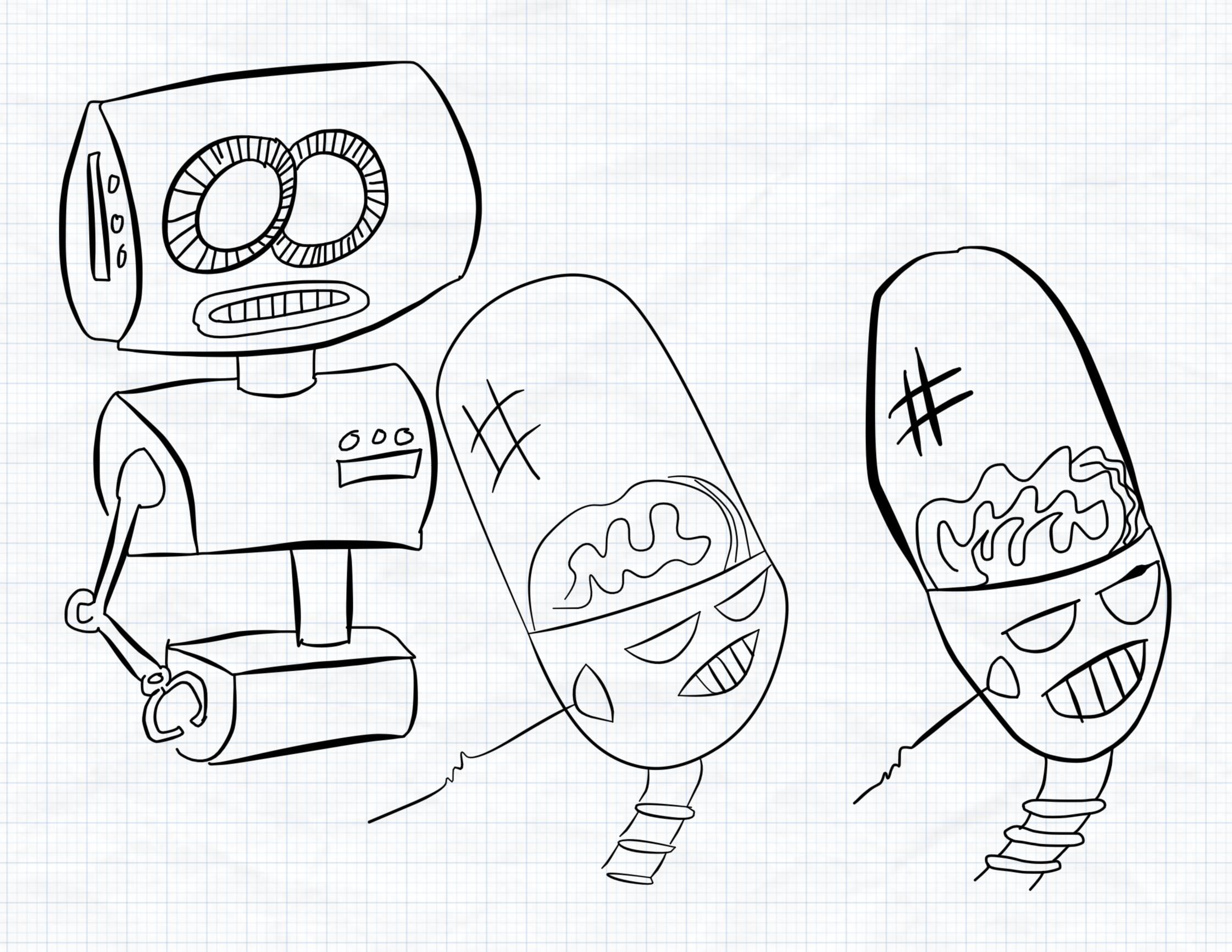
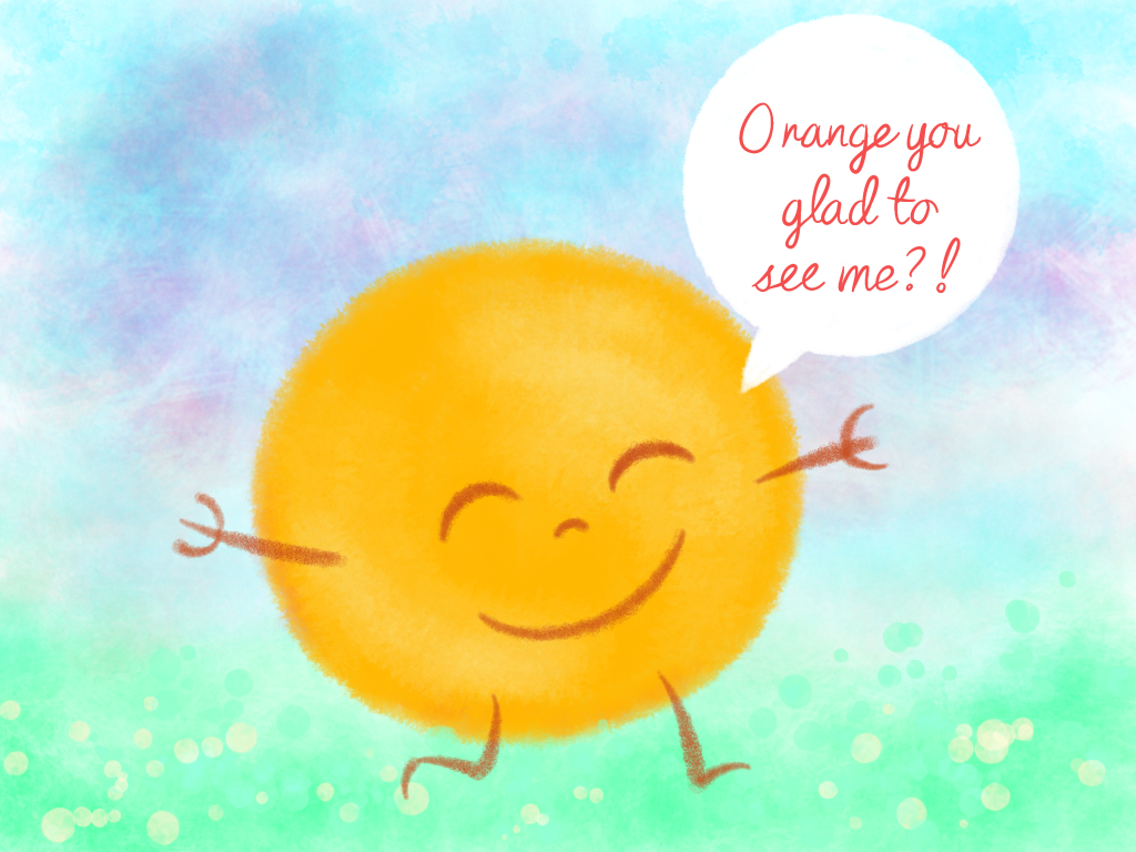
So I decided to draw the same image again in a couple of other apps I have. I tried Procreate first:

Same drawing recreated in Procreate
The biggest difference I noticed was the lack of paper texture. I don’t know if there’s a simple way to add a paper texture to artwork done in Procreate. I could always scan in a textured image and add it as an overlay layer, but I would prefer to have the option to add texture right there in the app. Also, Procreate doesn’t have a text tool, so I had to handwrite the text. On the plus side, I still get a lot of nice textured tools (again, I got that slightly rough edge around the orange) in Procreate and I found it much easier to adjust the brushes to get the effects I wanted. I can also create and save custom color palettes in Procreate, and it’s easier to pan and zoom artwork. Plus I can ROTATE the artwork on the fly, something Sketches doesn’t do.
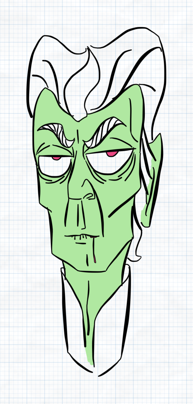
For the last trial, I decided to do this drawing in SketchClub.

And finally, done in SketchClub
SketchClub is one of my favorite drawing and painting apps on the iPad. I have a lot of control over the brushes and other tools, and can download or create new brushes. Procreate will let me create new brushes, but doesn’t have the option to download brushes from a community of users. It also has a text tool, but since SketchClub didn’t seem to have access to the same fonts that Sketches does, I decided to handwrite the text again. And like Procreate, I can zoom, pan, and rotate the screen with ease.
One of the biggest differences I noticed between SketchClub and the other apps is the lack of an actual water color brush. In Sketches, there is a water color brush tool. In Procreate, there’s a setting for the brush tool that gives it a water color look. But I think if I played with some settings in SketchClub, I might be able to achieve a similar effect.
Anyway, that’s the same drawing done in three different apps. I still haven’t decided if I want to buy Sketches or not. The biggest drawback is the way it handles zooming and panning, and the inability to rotate the artwork. That makes a huge difference to me.
So what do you think?


