Click on the image above to see it bigger!
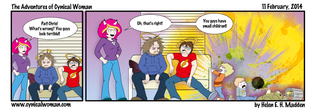
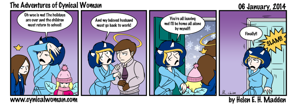
The Hubster and the children inform me that I have drawn Uncle Paco perfectly. Paco is one of Hubster’s 4 brothers. His son, Jaleo, graduates from college this year. No kidding, that freakishly tall kid was an infant in poopie diapers at my wedding. And now he’s finishing college and already got a job lined up at computer software company. I feel old just thinking about it.
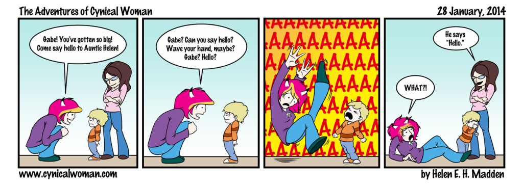
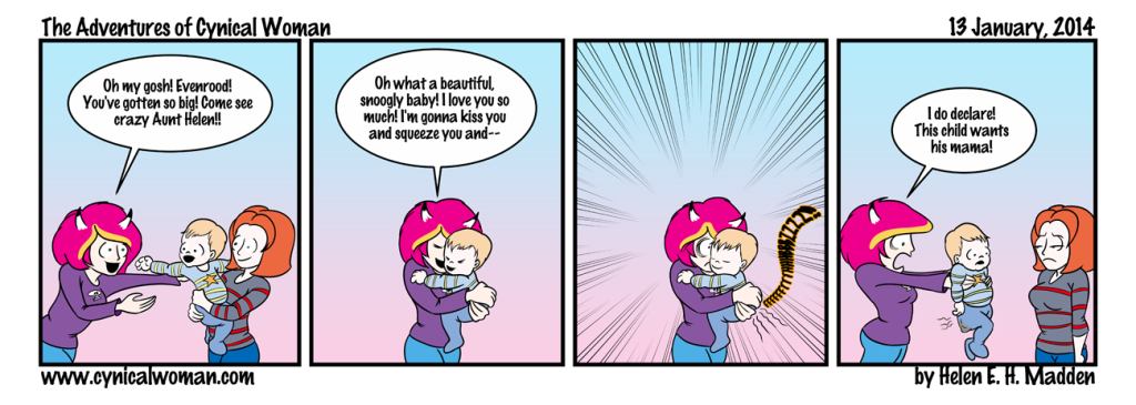
With regards to Hubster and his brothers… Hubster is the oldest of 5, Paco is the second child, and then there is Patrick, Carlos, and Chris, in that order. Chris has been in the webcomic once before. His son is Evenrood. Gabe is Patrick’s son. All 5 of the brothers are “saints,” thus the halos. They became “saints” when they were very young. Hubster’s parents traveled often to Puerto Rico, where my mother-in-law is from, and there was an artist in San Juan who painted plaques of saints. The first year they met him, he painted plaques of my father-in-law, mother-in-law, and the Hubster all as saints. The next year, when they had another baby (Paco), the same artist painted a saint portrait of him. And the year after that, he painted one of Patrick. The artist disappeared after that, but when Patrick was older, he painted saint portraits of the youngest two brothers, Carlos and Chris. And their saint names are…
- Saint Jerry, Patron Saint of Good Husbands
- Saint Carmen, Patron Saint of Good Wives
- Saint Michael the Magnificent (the Hubster)
- Saint Paco the Perfect
- Saint Patrick the Powerful
- Saint Carlos the Crafty
- Saint Christopher the Cheerful
And this is why when I draw the Hubster or any of his brothers, they all have halos. So now you know!
By the way, this webcomic was actually all done and ready to be posted yesterday afternoon. Then I discovered something very annoying about Manga Studio 5 and Photoshop.
Do you see the plaid pattern on Paco’s shirt? That’s a Manga Studio material/screen tone. It was originally yellow, but I wanted to make it a shabby sort of blue, so I check the option in the materials panel to make the plaid material a black and white screen tone instead of its original yellow color. I then set the blending mode for the material layer to “color burn” and painted a medium blue color on a layer underneath that. The result was the exact shade of blue plaid that I wanted for Paco’s shirt. Hurrah!
(If none of the above made any sense to you, don’t worry. I’m just being a huge graphics geek here. The basic gist of this is, I wanted to make a yellow pattern blue, and that was how I did it.)
Then I went to export the image as a flattened PNG. That’s the file format I use for all the comics. But for some reason, the exported flattened image lost the blue plaid on the shirt and left me with a gray-scale plaid instead!
“Okay,” I said to myself. “Maybe Manga Studio has a problem with flattening layers with blending modes. I’ll just export this sucker as a layered Photoshop file instead and do the flattening in that program!”
And I did that, and when I pulled up the layered file in Photoshop, I saw that I had all my layers but that the plaid material layer had been set to “normal” as the blend mode so it still showed up as gray-scale instead of faded blue.
Well, that was no big deal. I reset the plaid material layer to “color burn,” got back that lovely faded blue, and flattened all the layers in Photoshop…
And promptly got the same gray-scale plaid material again.
I then spent hours researching what the problem could be. No matter what I tried, I couldn’t get Photoshop or Manga Studio to keep the blending mode of the plaid material set to “color burn.” The moment I flattened the image, I kept getting the gray-scale, “normal” blend mode instead.
How could this be?! I’ve been working with Photoshop for 5 years or so now. I know I’ve flattened images with blending layers before, and not had ANY problems! In fact, just about every image I’ve ever created with Photoshop used various blending modes and I don’t recall having any problems with any of those images! So why was I having problems with this image now?
After hours of searching the web, I ran across a comment that pointed me in the right direction. It was a short comment, buried deep in the responses to a graphics forum post from someone who had had similar problems to me a few years before. The comment mentioned how someone at Adobe had really screwed up when the wrote the code for the “color burn” blend mode.
And that’s when I realized that I had never used the “color burn” blend mode in an image before. I know I’d tried it while working on some images, but the result was never something I liked and so I switched to another blending mode instead, like “overlay” or “soft light.” So I opened up the layered comic in Photoshop again and this time set the blending mode for the plaid material to “soft light,” and then flattened the entire image. And it worked just fine. “Soft light” works a bit differently than “color burn” so I got a different shade of blue, one not so perfectly faded. But hell, it worked!
So that was the problem. The “color burn” blending mode in Photoshop (and apparently Manga Studio as well) is pretty much all screwed up, at least in CS3. It was such a tiny little thing in the end, and it took me only 5 hours to figure it out!
You live and learn. Painfully, most of the time, but still, you learn.
Enjoy the webcomic. I’m getting started on the next one tonight!


