More and more, I'm getting into the habit of drawing in bed in the morning before I get up to start the rest of my day. Actually, the routine has been a) wake up and feed the cats, b) grab a cup of coffee, c) get back in bed, d) read a comic book (this week I've been reading “Adventure Time”), and then e) draw for an hour or so. The end result is that I have a nice morning without being nagged by the cats and I get some artwork done. The rest of the day may go to hell in a hand basket, but at least I got some drawing done, and hey, coffee!
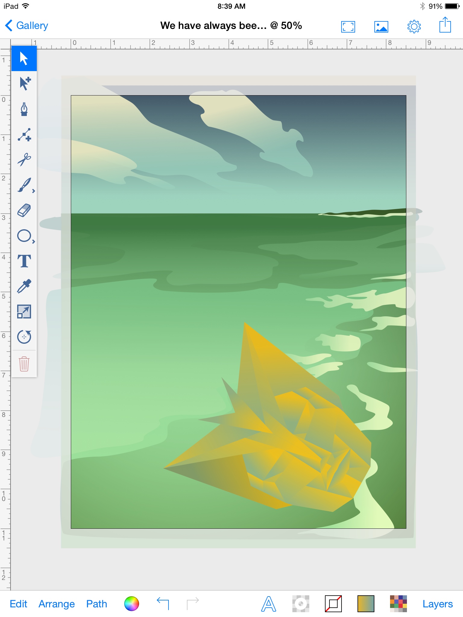
All this drawing is happening on my trusty iPad right now. For this particular drawing, I've been bouncing back and forth between a couple of different apps. The main work is being done in InkPad, a vector drawing app that I highly recommend. InkPad became open-source this year, so there are lots of copycats out there now, and you have to pay for those copycats. Don't. Get the original app. It's worth it.
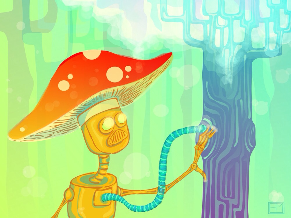
Anyway, I'm using InkPad because I want to be able to resize this particular drawing to any size, and vector will let me do that. Plus I want to experiment with drawing in a more organic style in vectors. The previous piece I did, “Tree Lighter,” was drawn in SketchClub using their vector tool. It's not the same thing because SketchClub is a raster drawing program – it draws pixels, not vectors, so I can't increase the size of the drawing once I'm done, only shrink it down. But “Tree Lighter” had this nice cut-out feeling, like layers of colors that had been cut from translucent paper and layered over each other to make the final drawing. I liked it and wanted to see if I could do the same thing in InkPad, so that I would then have the advantage of being able to make the image bigger if I wanted to use it for posters, t-shirts, etc.
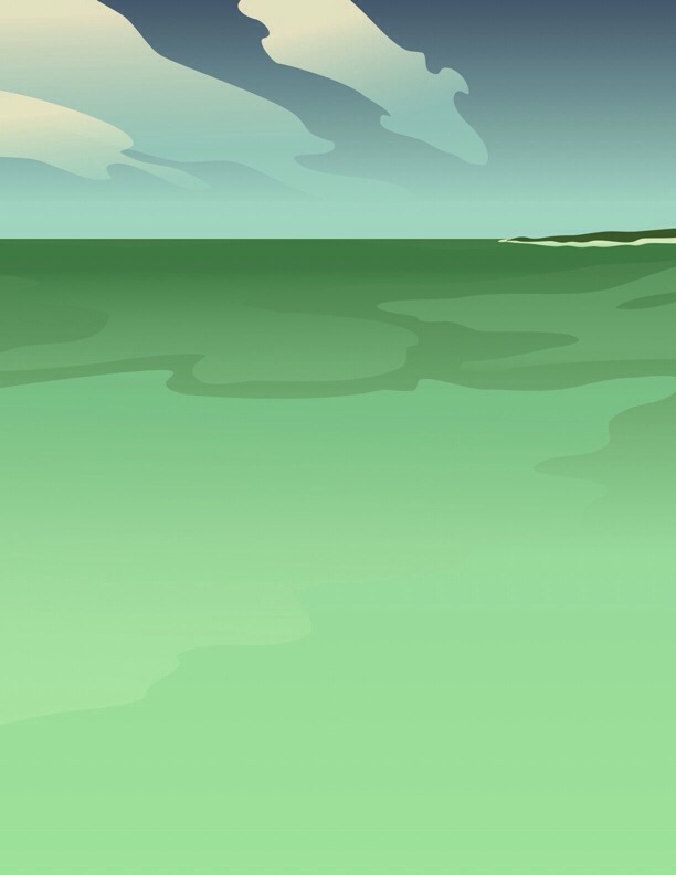
For “We Have Always Been Here,” I started with the background – sky, clouds, distant landscape, the ocean and some waves. I'm using a photo from an old National Geographic book for reference. Most of the pieces were given a gradient fill, from a solid to translucent color, to give a sense of shading and volume.
Once I had the background laid out, I took a snap shot of the image and imported that into SketchClub so I could sketch the focal piece of the image – a sort of clunky robot sitting on the remains of a giant, more sophisticated robot. The idea was to show this peaceful sort of post-apocalyptic scene. The robot society used to be this mighty empire, but they fell, and now the current generation of robots live a much simpler life. But there's also a hint that maybe the robots haven't always been here, because the ruined giant robot has very human features, unlike the current clunkier robot, so who came before the robots? And where are they now?
Yes, it's a deep theme. I'm deep like that.
Anyhoo, drawing the clunky robot has been easy. I used my normal style of sketching robots and drew one quickly in SketchClub, then imported that drawing back into InkPad where I traced over it with the vector tools, adding gradients to suggest a metal surface and then laying further gradients over top of that to suggest shadows and highlights.
And that was the easy part. Now I'm struggling with the giant robot head that my little robot guy is supposed to be sitting on. I had a nifty, angular mecha head drawn, but I couldn't get the perspective right no matter what I tried. So I finally turned to another app, 123Dsculpt, to get a new reference image. 123Dsculpt by Autodesk comes with some pre-made models that you can play with, including a human head! I loaded that up, rotated it around, and took a snapshot of that. Then I imported that snapshot into InkPad and began drawing over it. To get the shading right, I ran the snapshot from 123DSculpt through Phototropodelic, a fun little app that creates cutout/poserterized style effects for photos. When I'm ready to add my shading to the giant robot head, I'll import the Phototropodelic image into InkPad and do some tracing there.
So, long story short, I've bounced around between InkPad, SketchClub, 123Dsculpt, and Phototropodelic. I'm drawing freeform by hand and also tracing elements that are giving me trouble. I'm not doing any precise tracing, since I want this to look rather loose and organic. And I'm using lots of gradients for the shading and highlights. And the result so far is…
And there ya go! I'll post more images as this progresses, but that's it for this morning's drawing work.


